SEEING RED: VISUALIZING FRICTION THROUGH METRICS
Lisa’s Lemonade Stand is a simple example. Lisa is the owner, manager, and sole employee (except when she asks her mom to step in). If you have a small business like Lisa’s or you just want to analyze your operation at the most macro of levels, creating a similar model is a snap.
Fortunately, this modeling technique works for complex businesses, too. In fact, for any size business, the more information you can visualize, the more useful—and accurate–your final model will be, showing you friction points that need your attention. I’ll walk you through the build of a top-level model so you’re clear on the fundamentals. Then I’ll help you refine your model and make it applicable to a more complex business with many more data points.
Before we get started, have the money model you created in hand as well as your illustrating tools of choice—markers and paper, computer software, or a pair of scissors and a print out of the Metrics Model Kit from the Business Visualization toolbox.
STEP 1: CREATE A MAP FOR YOUR METRICS
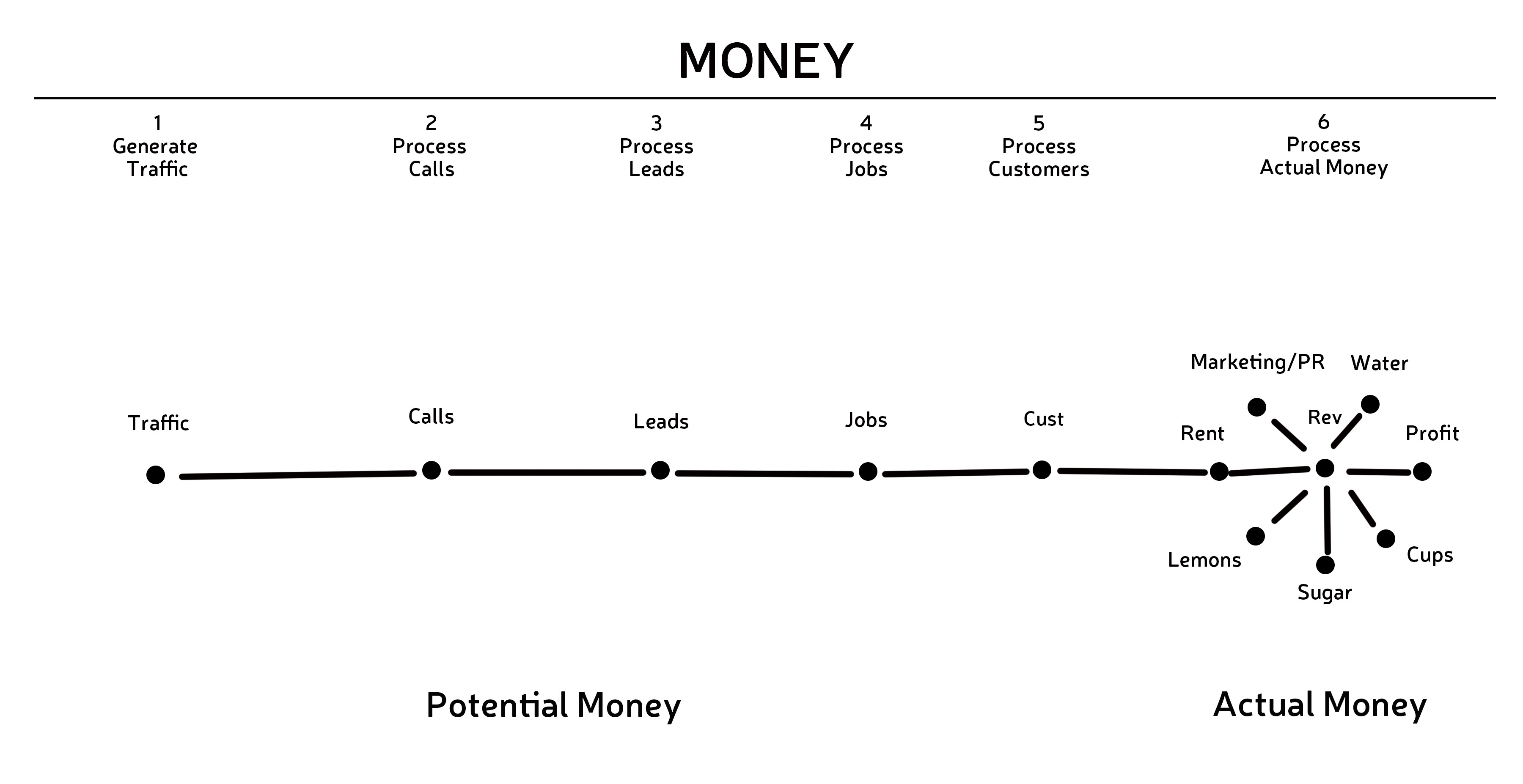
The first step is translating your money model into a metrics map.
The lemonade stand example in the previous section showed us how to do this. Just draw a dot at the center of each of your gears and connect the dots with lines. You’ve got your map! These lines, if you recall, mark the points where we want to measure quality.
STEP 2: DECIDE WHAT TO MEASURE
Now that you know where you’re going to measure quality, you need to decide what to measure. On the Sales Funnel, or Potential Money side of the map, the lines will measure the quality of the sub-processes that move customers (and money) from one gear to the next. Specifically, they’ll describe the quality of your conversion of traffic to calls, calls to leads, leads to jobs, and jobs to customers. These metrics are objective because you can measure them with hard numbers. On the Income Statement, or Actual Money side of your map, the lines will measure the quality of your costs. These metrics are usually subjective.
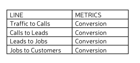
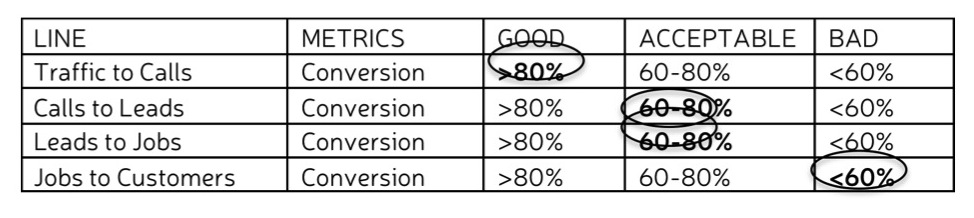
Let’s start with the lines on the Sales Funnel. On paper or using a spreadsheet or table, create a grid. In the first column, describe the place that you are concerned with. In the second column, indicate the thing that you’re measuring there. For example:
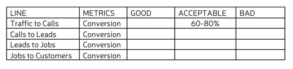
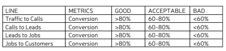
STEP 3: DETERMINE STANDARDS OF QUALITY
For each of your metrics, you’ll need to determine quality standards. Do this by adding three more columns from left to right labeled “Good,” “Acceptable,” and “Bad.”
Set a target for each metric. This is an adequate or acceptable level of quality, based on what is expected or required. It might be a precise number or a range. Enter your targets in the column labeled “Acceptable.” For example, if you’re able to convert 10,000 in traffic to between 6,000 and 8,000 calls, that could be your standard for acceptable:
Once you’ve established Acceptable entries for each metric, you can easily calculate the Good and Bad. Good is anything better than Acceptable. Bad is anything worse.
STEP 4: ASSESS YOUR METRICS
Now it’s time to figure out where your actual numbers fit. Still clutching your money data in one hand?
Good. Work through your grid and identify where each metric falls in terms of quality standards. So for example, if my business has an 81% conversion rate from traffic to calls, that’s good. If it has a 65% conversion rate from calls to leads and a 70% conversion rate from leads to jobs, those are both acceptable. If the jobs to customers conversion rate is 50%…ooh, that’s bad.
At this point, you’re ready to start visualizing.
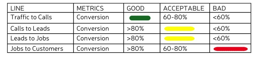
STEP 5: CONVERT YOUR METRICS TO CODED LINES
Good metrics will be represented by short green lines. Acceptable metrics will be medium length yellow lines. Bad metrics will be long red lines (this makes the friction points easy to spot).
Change the numbers on your grid to the appropriate lines.
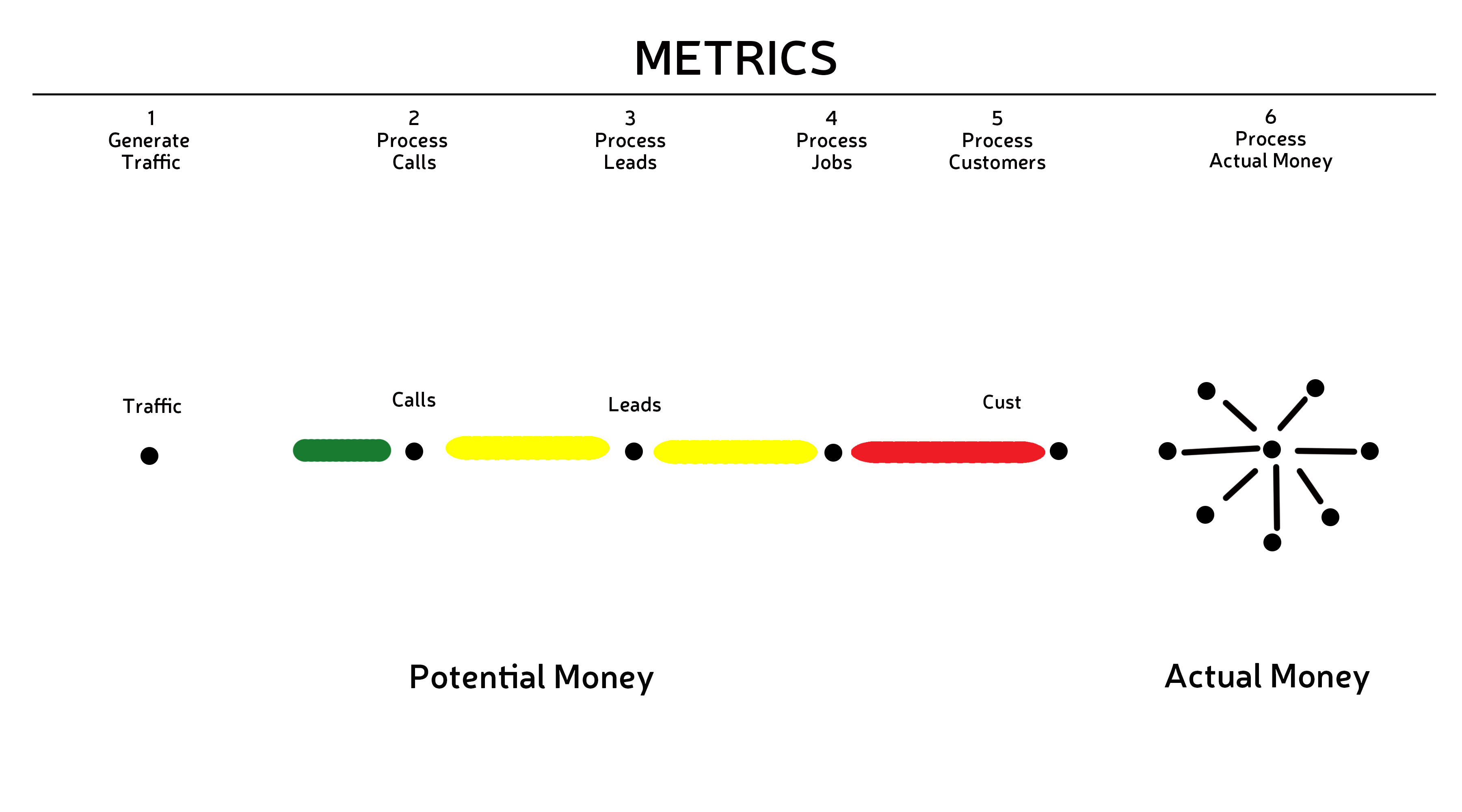
STEP 6: PUT YOUR METRICS ON THE MAP
Once you’ve translated your metrics into symbols, it’s time to revisit your map from Step 1. Replace each of the lines with the respective, coded line from the grid. Your map should now look something like this:
 STEP 7: DO IT ALL AGAIN
You’re probably noticing at this point that your picture, like mine above, is incomplete. That’s because we’ve only filled in metrics for the Potential Money section of the map. Complete your model by repeating each of the above steps for the lines associated with your Income Statement, or Actual Money. Remember, for this section, you’re looking at the quality of the things you’re spending money on.
When you’re done, you should have a complete metrics model. Like this:
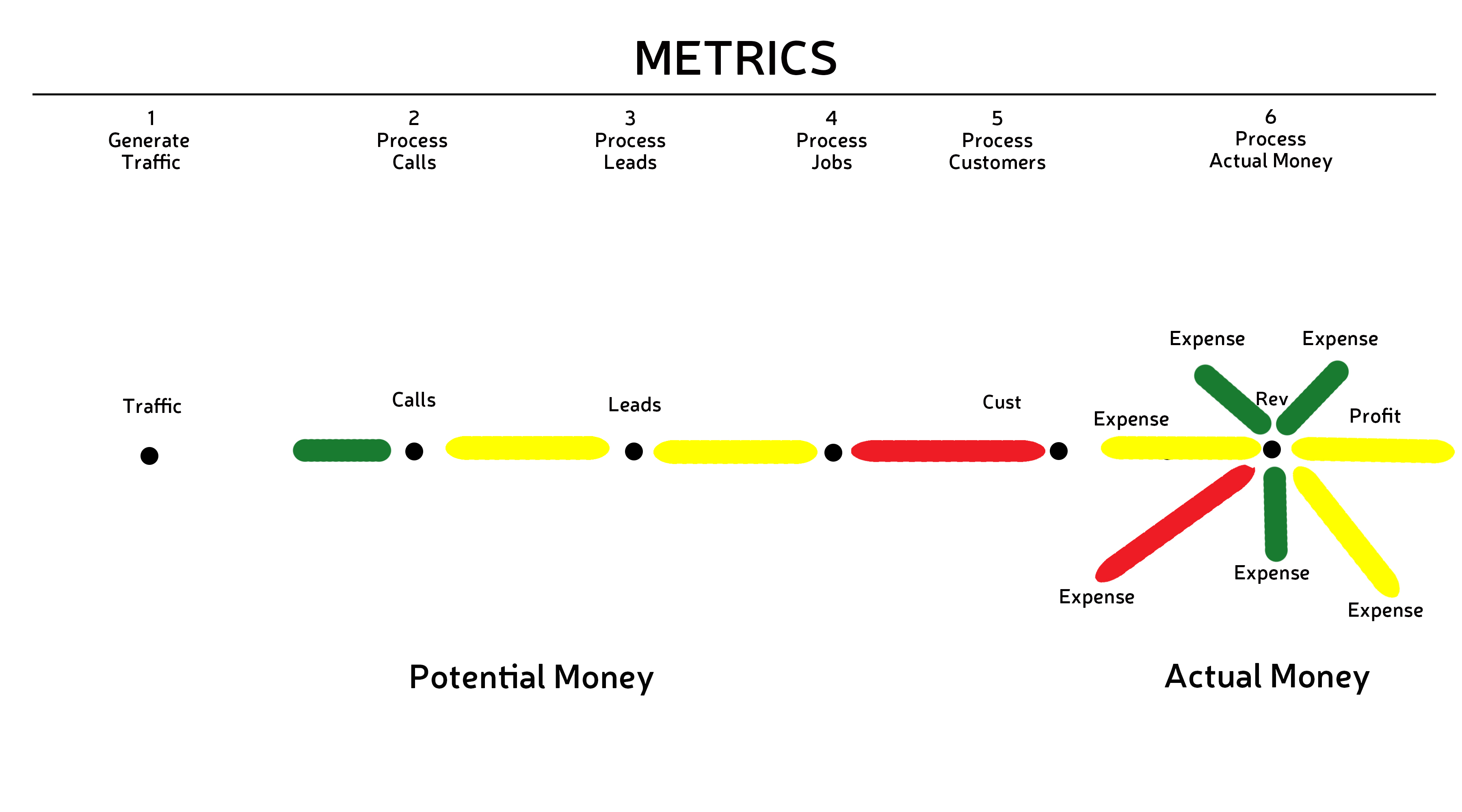 Notice the hot spots? There’s your friction.
- A Metrics Model consists of three parts: A timeline representing the processes involved in the circulation of money for your business; a Potential Money side (i.e., the sales funnel); an Actual Money side.
- Measurements of quality are taken in the places in between money gears and they are represented by short green lines (good performance/high quality), medium length yellow lines (acceptable performance/quality), and long red lines (bad performance/low quality).
In the next section you will learn more advanced techniques that will let you take a deeper look at your business metrics.
Continue to Refining The Picture >