THE MODEL EMPLOYEE: VISUALIZING PEOPLE
Businesses are generally made up of many people, and memorizing and conceptualizing the efficiency of each person in the different aspects of their job role can be a challenge, particularly since people have lots of small job functions, each of which supports a different part of the overall process. It’s enough to make your head spin. Not unlike our friend in the picture below. But there’s no reason your head has to spin. No matter how many employees you have, my approach to visualization offers an easy way to see and keep track of the value of the work that each person is doing. Here’s how:
As with each of the previous units, in order to create your own employee model, you will need something to visualize with—paper and pens or a computer program. You can also use the printable People Model Kit from the Business Visualization Toolbox.
Since this model weighs quantity against quality to determine value, you will need to have both your money model and your metrics model handy for reference. Finally, since people are the focus here, you’ll need a roster of all of your employees and a list of the job functions and tasks performed by each.
STEP 1: CHOOSE AN EMPLOYEE
In order to create a picture that allows you to compare the value of the work done by your employees, you first need to create a model for each individual person. So, step one is choosing who to evaluate.
STEP 2: ESTABLISH YOUR HORIZONTAL AXIS
Your employee model is going to take the form of a grid or a matrix. Establishing the horizontal axis for this grid is a snap because it’s the same timeline that you’ve worked with in both your money and metrics model. Your timeline should look something like this:
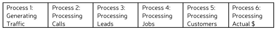
To recap, this shows you the processes that move money through your business engine.
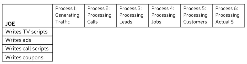
STEP 3: ESTABLISH YOUR VERTICAL AXIS
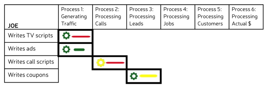
Each of the processes on your timeline is carried out by people performing a variety of job functions and tasks. This information that will go on your vertical axis. List the process responsibilities of your chosen employee. For example, I’ll choose Joe. Joe’s job function is writing. Specifically, he writes TV scripts, print ad slogans, call scripts, and coupon copy. I’ve listed these responsibilities in the first column of my grid:
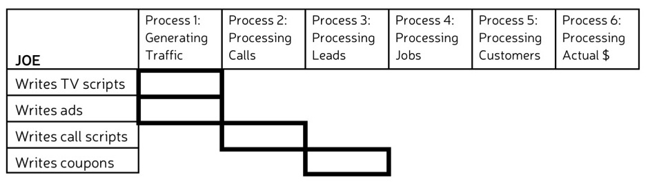
STEP 4: PLOT OUT WHERE PROCESSES AND JOBS MEET
The processes in your business engine for the most part follow a linear chronology, but some employees will contribute to multiple processes. For your chosen employee, draw the outline of a rectangle at the intersection of each process and job function or task. So, for instance, Joe contributes to Processes 1, 2, and 3. I would plot the following on Joe’s grid:
STEP 5: PLUG IN MONEY AND METRIC FINDINGS
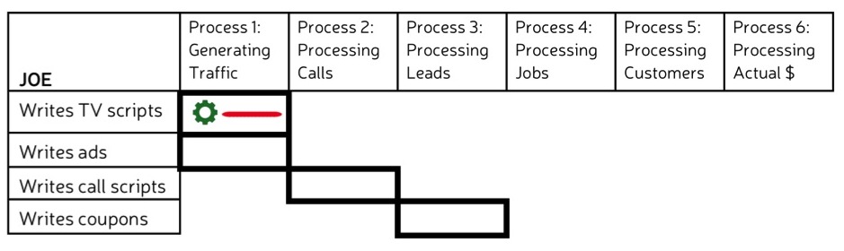
Since the goal of this model is to calculate the value of your employee’s work based on quality v. quantity, the next step is plugging in information that tells you how much your employee costs and how well they are performing. If you dug deep enough in your money and metrics models, you have probably already assessed your chosen employee in both respects and have colored gears and lines associated with each plot on your grid. If you don’t, that’s okay. You can do the cost and metric assessments for the individual now (For step-by-step instructions, review Unit 3 and Unit 4). Once you have this information, add it to the corresponding rectangles in the employee grid. Here’s an example of how this will look:
My employee Joe writes TV scripts very quickly and doesn’t demand a very high hourly rate. So when I look back at my money model, I find that his gear for that task is green. However, Joe’s scripts aren’t all that great. So when I look back at my metrics model, I find a red line. I put both visual symbols into the grid.
I continue to plug in the corresponding money and metrics assessments until each rectangle is accounted for.
STEP 6: CALCULATE VALUE
With all of your money and metrics data in the grid, you can now calculate value. The way that value is calculated for any particular task is the same way that we calculated averages in the Metrics Unit. Namely, we weight each item relative to importance (for a total of 100%), multiply each weight by the line color number (green=1, yellow=2, red=3) and then take the sum. So, if cost and quality are both weighted 50% across the board, Joe’s green gears and lines will equal .5, his yellow gears and lines will equal 1, and his red gears and lines will equal 1.5. He has a green gear and a red line for writing scripts, which adds up to 2. His total for writing ads—a green gear and a green line–equals 1. And so on.
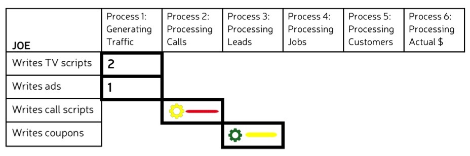
Go ahead and calculate the value for each of your rectangles.
STEP 7: COLOR-CODE YOUR RECTANGLES
Now for the really easy part—coloring in your rectangle. As you can probably guess by now, every 2 will be represented by a yellow rectangle, meaning acceptable value. Every 1 will be a green rectangle—high value. Every 3 will be a red rectangle—low value. Color in your rectangles. For Joe, the final product looks like this:
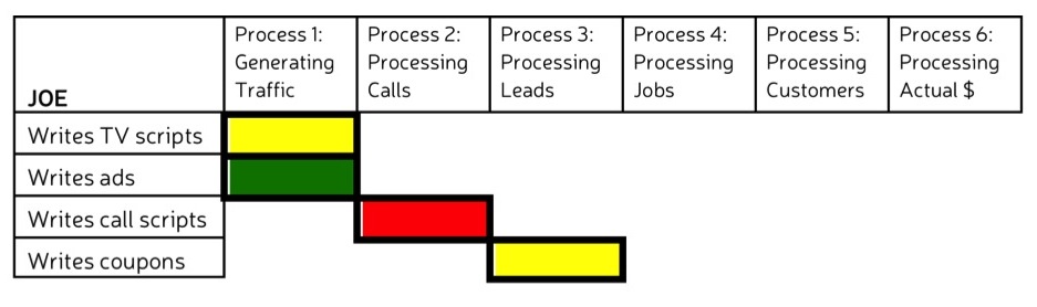
I can immediately see where Joe’s work is low value.
STEP 8: REPEAT
Now that you’ve made it through one employee, you should have the hang of it. Go back and create a grid for each of your employees following the steps outlined.
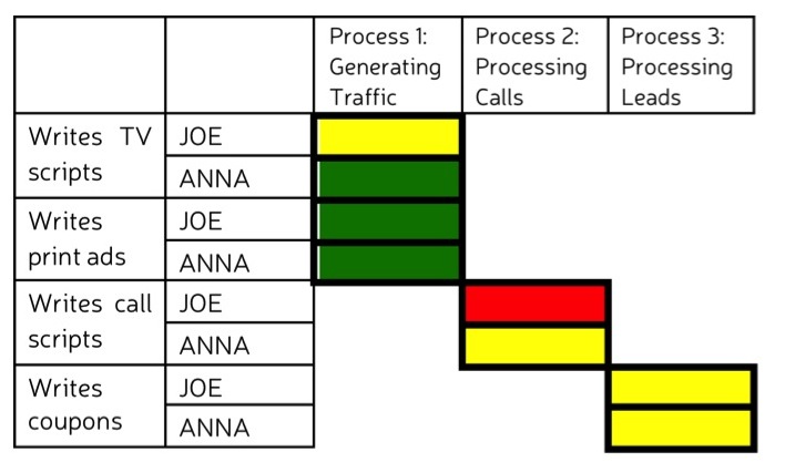
At this point, you might decide that you are done. You can use your visuals to see where an individual employee’s work value could be higher or to compare one employee to others doing the same job. If a pattern emerges, it may indicate a larger problem in my business engine. For instance, I might compare the value of Joe’s work to that of Anna, my other copywriter, who performs the same tasks.
Or, you might decide that this view offers more information than you need. You just want to be able to see the overall value of each employee’s work to the business in a single rectangle. In that case, there is an additional step.
STEP 9 (optional): ASSESS OVERALL VALUE
To combine all your colored rectangles into one, follow what should, by now, be a very familiar formula. For each process, weight the job functions and/or tasks that your employee performs, multiply by the color weight, and add the numbers together. At the process level, roll the values together the same way. Weight the importance of the work the employee does at each process, multiply by the color weight, and add together. You will end up with a single, colored rectangle representing the value of that individual’s work.
For Joe, I’m going to weight writing TV scripts at 60% and print ads at 40% because I know that our TV spots get more viewers than our print ads. (.6 x 2) + (.4 x 1) = 1.6. I round up to 2 and Joe gets a yellow rectangle for the value of his Process 1 work.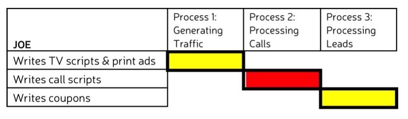
Now I’ll weight Joe’s Process 1 and Process 2 work at 40% each and his Process 3 work at 20%. Based on the math, Joe ends up with a single yellow rectangle. Overall, the value of his work is acceptable. And I can compare the value of Joe’s work to that of every other employee in his department…
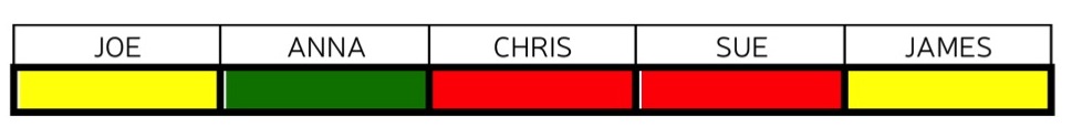 Or across the entire company.
You choose the picture you want to see.
STEP 10: ADD MOTION
The final step for your people model—just like your money and metrics models—is to factor in motion. As with metrics, the best way to do this short of creating customized software, is to chart the information at select periods and then put all of the resulting pictures together into a movie or a flip book. Either will animate your picture, showing you how and where value is changing—or not changing over time.
And if you can see the low value, you can fix it.
- A People Model consists of a timeline representing the processes involved in the circulation of money for your business and a list of job functions or tasks performed by each employee during each process.
- The value of the employee’s work for each task at each process stage is determined by taking the weighted value of the cost of their work and the quality of their work on the same task at the same process stage.
- Value is represented by green (high value), yellow (acceptable value), or red (low value) rectangles.
- People Models are useful for seeing where an individual is turning out work of high value and where they need improvement. They are also useful for comparing the value of the work of multiple employees.
- By putting together People Models created at various points of time you can see changes over time.
Now that you can see the money, metrics, and people in a business, in the next section you will learn how to optimize these functions to get better results.