REFINING THE PICTURE
Now that you understand the basic principles of visualizing metrics, I’m going to show you how to get an even better, more accurate view of your business performance.
In the steps above, we focused on getting top-level information. But we can—and should—take a deeper look by breaking down each of our lines into its constituent parts.
DEPARTMENTS
Unless you’re a one-man or woman Lemonade Stand, you probably have one or more departments or work groups to analyze. Use the steps outlined above to visualize how each department is performing, separately and together.
Let’s give it a whirl.
I’m going to focus on the line between calls and leads. Let’s say I own a business that has both a call center and an office for walk-ins. Both can convert calls to leads. My first step would be to make a new grid with a row for these two “departments.” Then I would establish the acceptable conversion range for each. That might be the same number, or it might be different. For this example, I’ll set an acceptable conversion rate range for the call center at 50-70%. For the office, it’s 60-80%. Set the good-bad parameters accordingly.
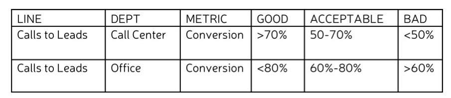
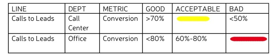
Now let’s imagine that my actual numbers for the call center fall into the acceptable range. I end up with a medium yellow line there. My office numbers, on the other hand, are bad, resulting in a long red line.
We can plug both metric lines into our model, one on top of the other, for comparison.
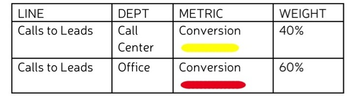
 Another option is to aggregate the two lines into one for the sake of our model. How do we do this? We start by determining the relative importance of each metric with regard to overall performance. This is represented by a weight attached to each metric. The total weight should add up to 100%.
In my example, the performance of the office is slightly more important to me than the call center because the leads that we get through the office are more likely to be converted to jobs. I’m going to weight the office’s conversion metrics at 60% and the call center’s at 40%.
The combined weighted average of the metrics will determine the length and color of the aggregate line. I multiply each weight by a number assigned to its color: Green is 1; Yellow is 2; Red is 3. Then I add the results.
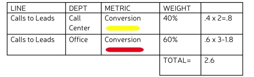
The total is 2.6. I’ll round up to 3. That means the aggregate line is a long red one. (Or if I wanted to get extra snazzy—and slightly more obsessive—I could use a shade of orange.)
 Ideally, you would want to track both the separate performances and their aggregate. If you’re working on paper, this might mean multiple models arranged on top of one another. If you’re working with some kind of computer software, you might be able to click on the aggregate line to reveal its parts.
Makes sense so far? Glad to hear it. Let’s dig down another level.
JOB FUNCTIONS
Most likely, each of your departments has multiple job functions. At my 1-800-GOT-JUNK? call center, for example, one group handles inbound calls, one group handles outbound calls, and one group handles customer service. I can measure the conversion rate for each of these groups, determine the good, bad, and acceptable ranges for each, and evaluate my data based on those ranges.
Let’s chart it out:
Now I can visualize by converting my findings into coded lines:
I can plug my lines into the map individually or aggregate them as described above—weighting each line and taking the sum of weight x color number for each line.
You’re getting the hang of it!
EMPLOYEES
Now let’s break it down even further and look at the quality of each employees performance. For the sake of example, we’ll give the Inbound call group three people and the Outbound and Customer Service groups one employee each.
As always, we start by setting our standards.
Then we assess our actual data and translate our findings into visuals
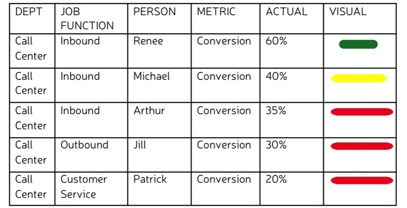
Bam. All of a sudden we can pinpoint exactly where friction is happening.
Hold your breath. We’re going to dive a bit deeper.
MULTIPLE METRICS
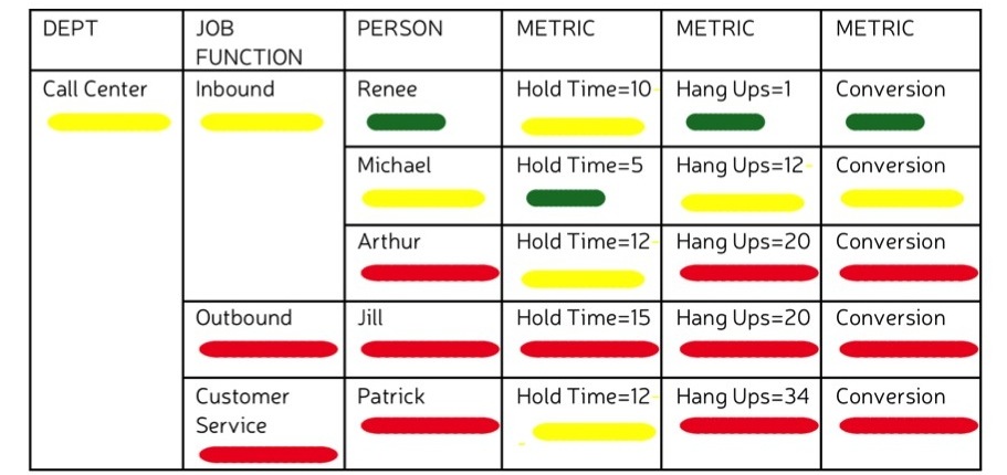
This time, let’s consider how to work with multiple metrics for each employee. In addition to conversion rates, I’m going to look at the number of seconds each call is put on hold and the number of calls that end in hang-ups. The steps are exactly the same as the ones we’ve been following. The only difference is that now, we have a different set of standards for each metric.
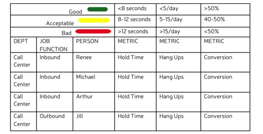
All we have to do now is assess our actual data and come up with our coded metric lines.
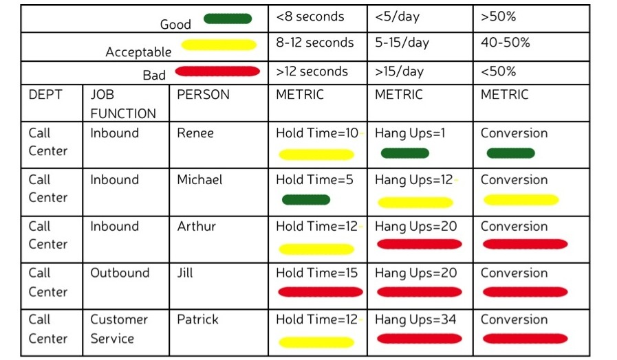
Viewing our metrics side by side like this is useful. It would seem, for instance that there is a correlation between the number of hang-ups and the conversion rates, but not necessarily between hold time and conversion rates. To reduce friction, then, I might start by working on reducing the number of hang-ups.
It might also be useful to see what the quality of each employee’s aggregate performance is—in other words, to represent each person with one colored line (as opposed to three). To do this, I would weight each metric and do the math just as I did to find aggregate lines above. In this instance, I might weight hold time at 25%, hang ups 25% and conversion 50%, Renee ends up with an aggregate green line. Michael’s line is yellow. Everyone else is red.
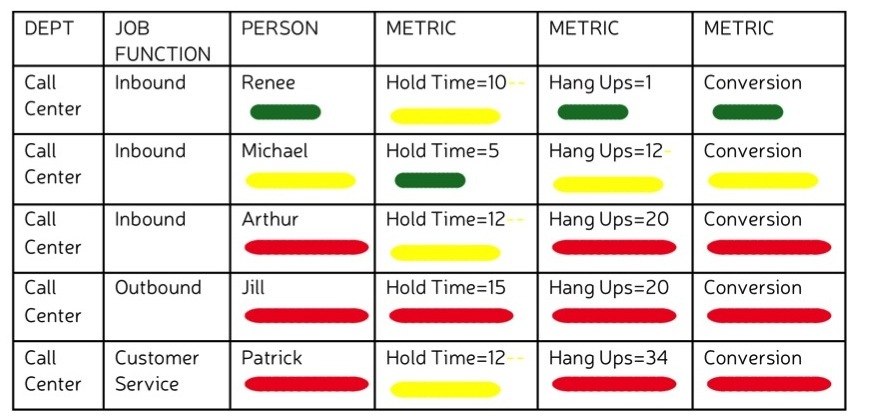
Since we started with the big picture—the Call Center—and broke it down step by step, we already know that the aggregate line for Inbound calls is yellow, while the ones for Outbound and Customer Service lines are red. We also know that all of the lines roll up into one Call Center line that is yellow. So we can skip the math. But if we’d started at the more granular level of employees, we could have worked our way backward, rolling together employees into job functions and job functions into department.
Finally, we would have placed the resultant line in its respective place on our map.
Whether I’m looking at breakdowns or have rolled up my lines and placed them in my metric model, one thing is clear: I’m seeing red. Not only that, but I’m seeing red quickly. I know where the friction is; I can pinpoint it on ever more granular levels; and I can use that information to prioritize where I need to oil my business engine to increase its performance.
Of course, this is just a snapshot. Your business metrics are always changing. The final step in all of this is putting your friction model in motion. With our money model we used spinning gears, rotating in clockwise and counterclockwise directions at different speeds. With some sophisticated software, you could program your friction model to change in real time. Lacking that, you can make your model dynamic by collecting a series of “snapshots” and putting them together—either with editing software to make a kind of animated movie, or on paper to form a flip-book. The more snapshots you collect the smoother the animation. This will allow you to see where friction is increasing or decreasing throughout the system, at what point, and under what circumstances.
- Metrics can be visualized for departments, job functions, or individuals. In other words, they can be as top level or granular as you like.
- By taking weighted averages, you can visualize the combined quality/performance of multiple individuals, job functions, or departments.
- You can represent multiple metrics for any given individual, job function, or department in your model.
- By putting together metrics models created at various points of time you can see changes over time.
In the next section you will learn about the role that people’s behavior plays in a business.