PUTTING PEOPLE FRONT AND CENTER
As with money and metrics, Lisa’s Lemonade Stand makes a great example for introducing how to visualize the value of an individual’s work. Since the stand is a one-girl operation, for this model, we’re going to focus on…you guessed it—Lisa.
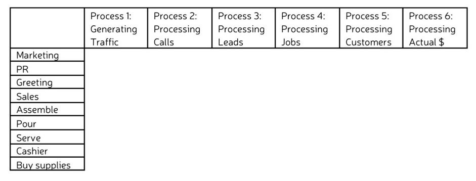
To start, I create a horizontal axis using the same timeline I used in Lisa’s money and metrics models. This lays out the processes that move money through the business system.
Then, I create my vertical axis by listing all of the job functions and/or tasks that Lisa performs relative to the timeline processes. For some of these I’ll stay high level—for instance, I’ll lump together all work Lisa does to generate traffic into two general job functions—marketing and PR. But I’ll breakdown more specific tasks that Lisa performs in order to process jobs—assemble lemonade, pour lemonade, serve lemonade.
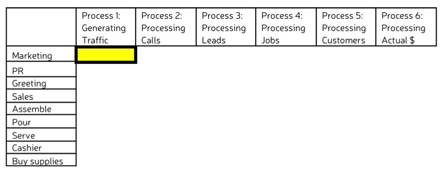
Now I am ready to assess the value of Lisa’s work at each process stage. For each job function or task, we will assess Lisa’s value by taking the weighted average of her costs v. her quality. Let’s say hypothetically that Lisa donates all profit from her lemonade stand business to a local animal shelter. Since she’s not keeping the profits for herself, she decides to pay herself for the work she does at a rate of $10 an hour. If the costs of Lisa’s marketing work are high (e.g. she’s working a lot of hours), she may have gotten a red gear on the money model. But maybe Lisa’s marketing work is very high in quality, a green on the metrics model.
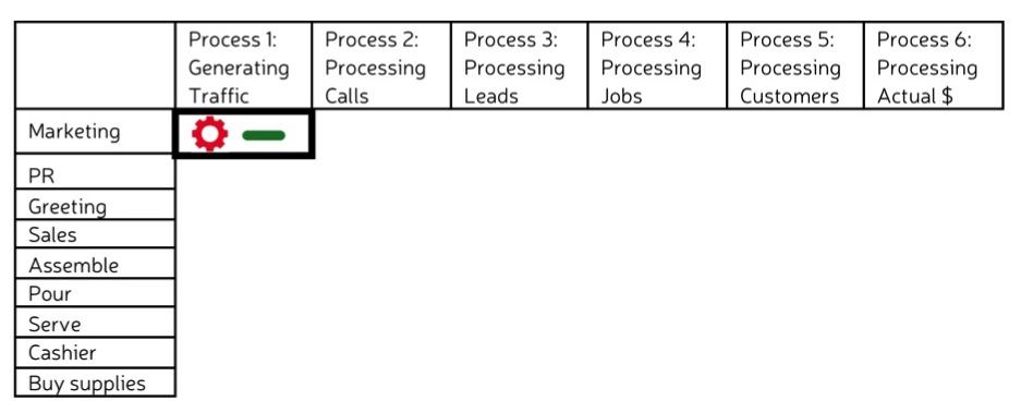
The value of her marketing work (cost v. quality) will net out as acceptable, a yellow rectangle on the current model.
As I move down the list of Lisa’s job functions and tasks, I’ll assess each in the same way and plot the correct colored rectangle at the place on the timeline where the work is performed.
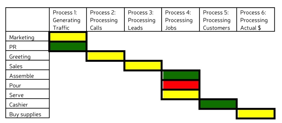
With this detailed picture, I can easily see that the value of Lisa’s work is low when it comes to pouring lemonade. If Lisa wanted to increase the value there, she could figure out what problem she was having with pouring lemonade and try to fix it. But I’ll save that for the next unit on optimization.
If I wanted to determine the overall value of Lisa’s work, I would roll up all of the data in this graph just as I did with the grids in the Metrics unit. I’d start by rolling up the job functions or tasks associated with each process. Some of these I might be able to eyeball—green marketing and green PR would make the value of Lisa’s work generating traffic green. Others I might have to determine using weighted averages. In these cases, I’d assign each job function or task associated with a given process a weight relative to the total value and adding up to 100% in total. Then I would multiply the weight by the number associated with the color of the rectangle—Green = 1, Yellow = 2, Red = 3. The resulting number would tell me the color.
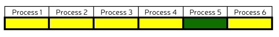
Once I rolled up each process, I’d roll the processes together to find out the color of the aggregate rectangle in the same way. In this case, the overall value of Lisa’s work is yellow. And that’s acceptable. If Lisa’s business expanded and she hired two more people—her mom and her friend John—I could assess the value of the work each of her employees did in visual terms and do an easy comparison.
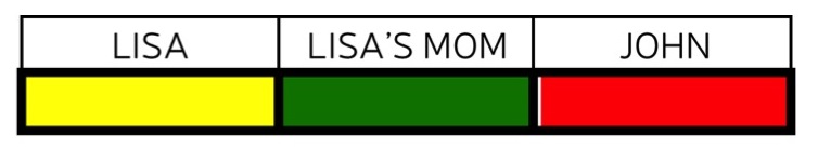
At a glance I can see that John’s work has the lowest value. Before worrying about what she or her mom could do to increase value, Lisa should probably focus on John.
Can you imagine how useful this model would be if your business had 50 employees? 100? 200?
- In Business Visualization, value is determined by taking the weighted average of the cost and quality of the employees work at any particular step in the production process.
- Value can be represented for as many job functions or tasks for each employee as desired. Value can also be determined for a group of employees.
- By taking weighted averages, the value of an individual or a group’s work in multiple areas can be represented by a single green (high value), yellow (acceptable value), or red (low value) rectangle.
In the next section you will learn how to model the value of your own employees’ work.